A culinary studio's identity, born from a single logo.
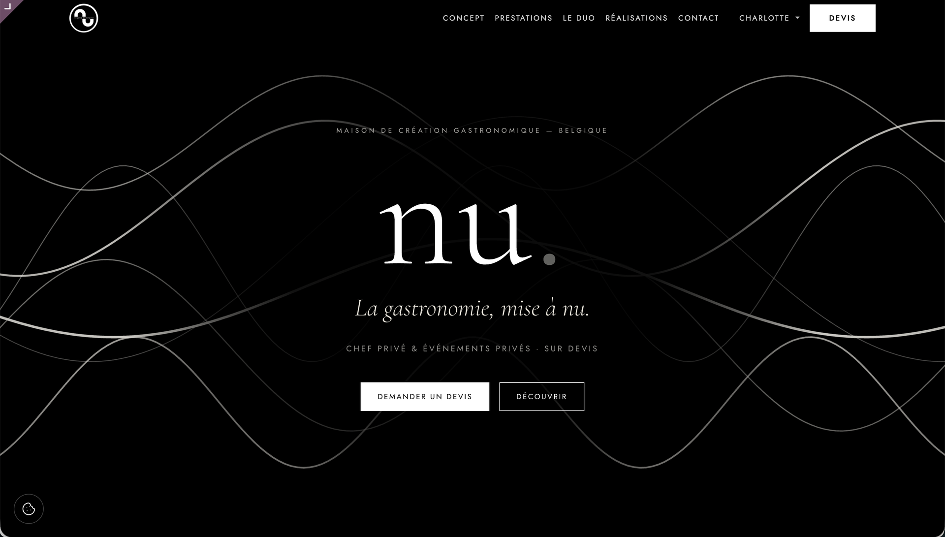
WebNest built nu studio culinaire's entire identity from a single element: their logo. A minimalist black-and-white direction, a typographic system, a photographic style and an animated line, brought together in a brand book that will serve as the foundation for the future website.
nu studio culinaire is a gastronomic creative studio founded by Nathan Urbanoviez and Simon Pauwels, childhood friends: one is the chef, the other runs front of house.
Exceptional cuisine at home and for events, with a clear ambition: refined and high-end, without showing off.
The starting point.
Launching a gastronomic creative studio is one thing. Giving it an image worthy of what's on the plate, before the very first service, is another.
nu was starting almost from scratch: a monogram, two partners and a clear ambition, refined and high-end without showing off. No brand guidelines, no visual world, no rules to fall back on. For a brand aiming for top quality, the real danger is looking ordinary from the very first touchpoint. A strong, consistent identity had to be established straight away, based on that one logo.
Our approach.
UX / Design
We started from the logo, which we left untouched, and derived everything else from it. The direction: luxury minimalism in black and white, where light and photography take the place of colour. A fine line, drawn in SVG and animated with restraint, runs through the whole identity like the precise gesture of a chef plating a dish. For text, an editorial typeface (Cormorant Garamond) carries the emotion, while spaced capitals (Jost) provide the rigour. The idea fits in one sentence: the image carries the feeling, the typography stays discreet, and nothing clutters the eye.
Technical
The identity was designed for the web from the very first sketch. The animated line is a lightweight SVG, not a heavy image, so it will sit effortlessly in a hand-coded QWeb website. The future showcase site will build on this foundation, with understated pages, full-width photography and a Typeform-style quote request form sent by email. Nathan and Simon will receive well-defined requests, whether for a private chef or an event, on a clean base that will grow with the studio.
Custom-built
Everything is brought together in a brand book that serves as Nathan and Simon's reference. It sets out the monogram and its usage rules, the palette of warm greys ranging from almost-black ink to ecru paper, the full typographic system, the photographic style (black and white, raking light, close-ups of textures) and the animated line that signs off the brand. Enough to design a menu, a shopfront or a social media page without second-guessing, and without betraying the original spirit.
What WebNest delivered.
nu now has a complete, consistent identity born from a single logo: a palette of warm greys, a typographic system, a photographic style and an animated line. Everything is defined and documented.
Nathan and Simon can design a menu, a shopfront or a social media page without second-guessing themselves. And the future showcase website will build on this foundation instead of starting from a blank page.
Frequently asked questions.
Why did nu studio culinaire call on a web agency specialising in Odoo?
What was custom-built for nu studio culinaire?
Can Nathan and Simon bring their identity to life without us?
Can another creative studio in Schaerbeek have the same kind of identity?


Un site vitrine qui vous démarque ?
Together, with no commitment, we look at how WebNest can take your online presence to the next level. Brief in hand, we get back to you within 48h.