
Launching your site with Odoo, is like receiving a giant box of LEGO : the possibilities are endless, but if you do not follow a minimum the plan, you end up with a wobbly thing that looks like nothing. rien.
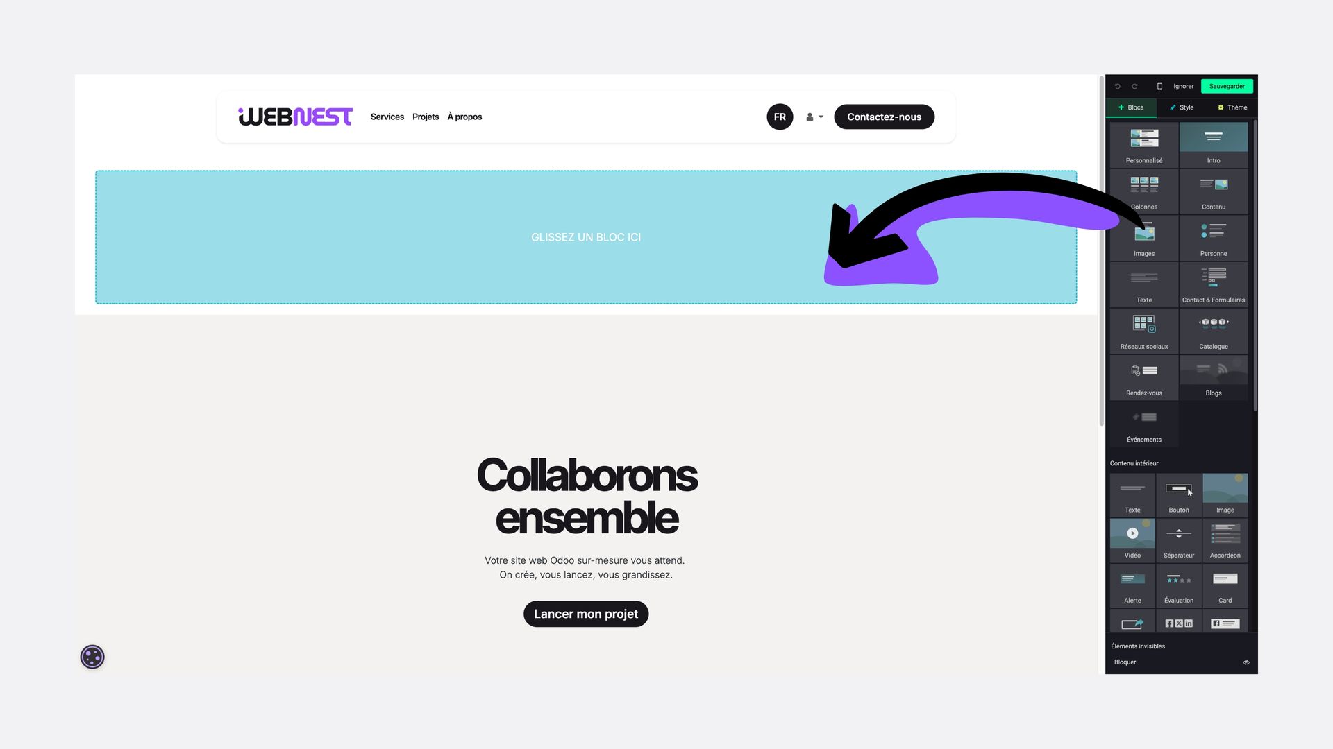
Overloading the homepage with too many blocks
This is the number one temptation: wanting to put everything in. Text, banners, carousels, customer reviews, Instagram feeds... Result? Your visitor is lost and leaves the site in less than 3 seconds.
Webnest advice :
Get to the point. A clear value proposition at the top of the page and a call-to-action button. Your site is not an all-you-can-eat buffet; it’s a gourmet menu: every element must be there for a good reason.
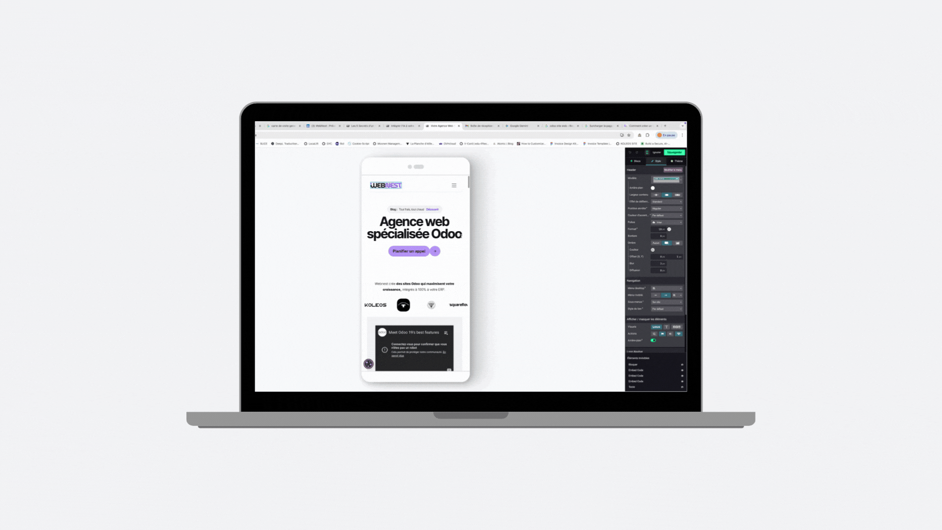
Neglecting mobile display optimisation
Whether for your product pages, your services, or your blog articles, AI can provide you with ready-to-use texts. It suggests titles, paragraphs, or rephrases your sentences to make them clearer and more engaging.
Using Odoo's default fonts and colours
Nothing screams "amateur site" more than a site that uses the standard settings of the base theme. If your site looks like your accountant's and your baker's, you're unlikely to make an impression.
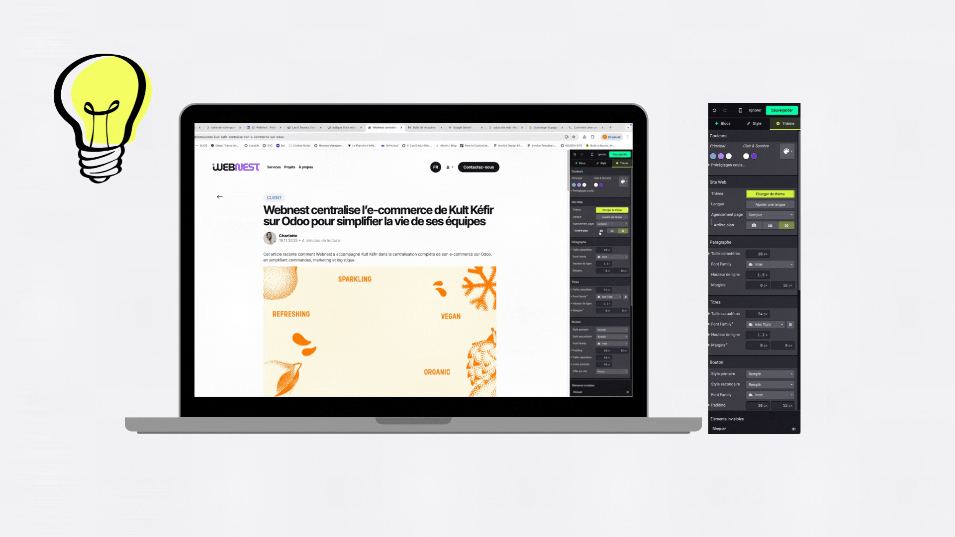
- The Webnest touch:Customise your colour palette and fonts from the start in the "Theme" tab. This is what gives your site its soul.
Forgetting to configure contact forms
This is the silliest mistake: your site looks great, people click on "Contact us", but you never receive the messages because the receiving email address is misconfigured or ends up in spam.
The reflex to have:
Test your forms yourself! Ensure that requests are arriving in your Odoo CRM or in your inbox.
Multiplying different fonts
Wanting to use one font for titles, one for text, one for buttons, and another to make it look "pretty"... is the best way to make your site unreadable and slow to load.
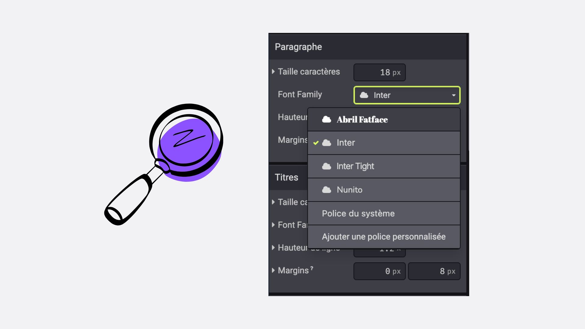
The golden rule:
A maximum of two fonts. One for titles, one for the body text. Visual consistency is what makes the difference between a "cobbled together" site and a "Webnest" site.
The Bonus: The trick to test your site like a pro
Before you shout victory and send the link to your entire address book, do the test of"the drunk user".
What’s the concept?Ask a friend (no need for them to be really drunk, I promise) to find specific information or purchase a product on your site in under 30 seconds, without help.
Why it’s useful:
- If they hesitate: Your menu is too complex.
- If they are looking for the button: Your design lacks contrast.
- If they succeed: You are ready for success.
The Webnest choice
- Building an Odoo site is easy. Building an Odoo site that sells and lasts is a profession. At Webnest, we avoid these pitfalls from the very first line of design so that you only have to worry about your sales.